Austin / ABC TV
Concept design / Paper Art / Photography / Art Direction / Project Management
The goal for this key art was to build on the popularity of Season 1 while also engaging new audiences for the second series of the comedy.
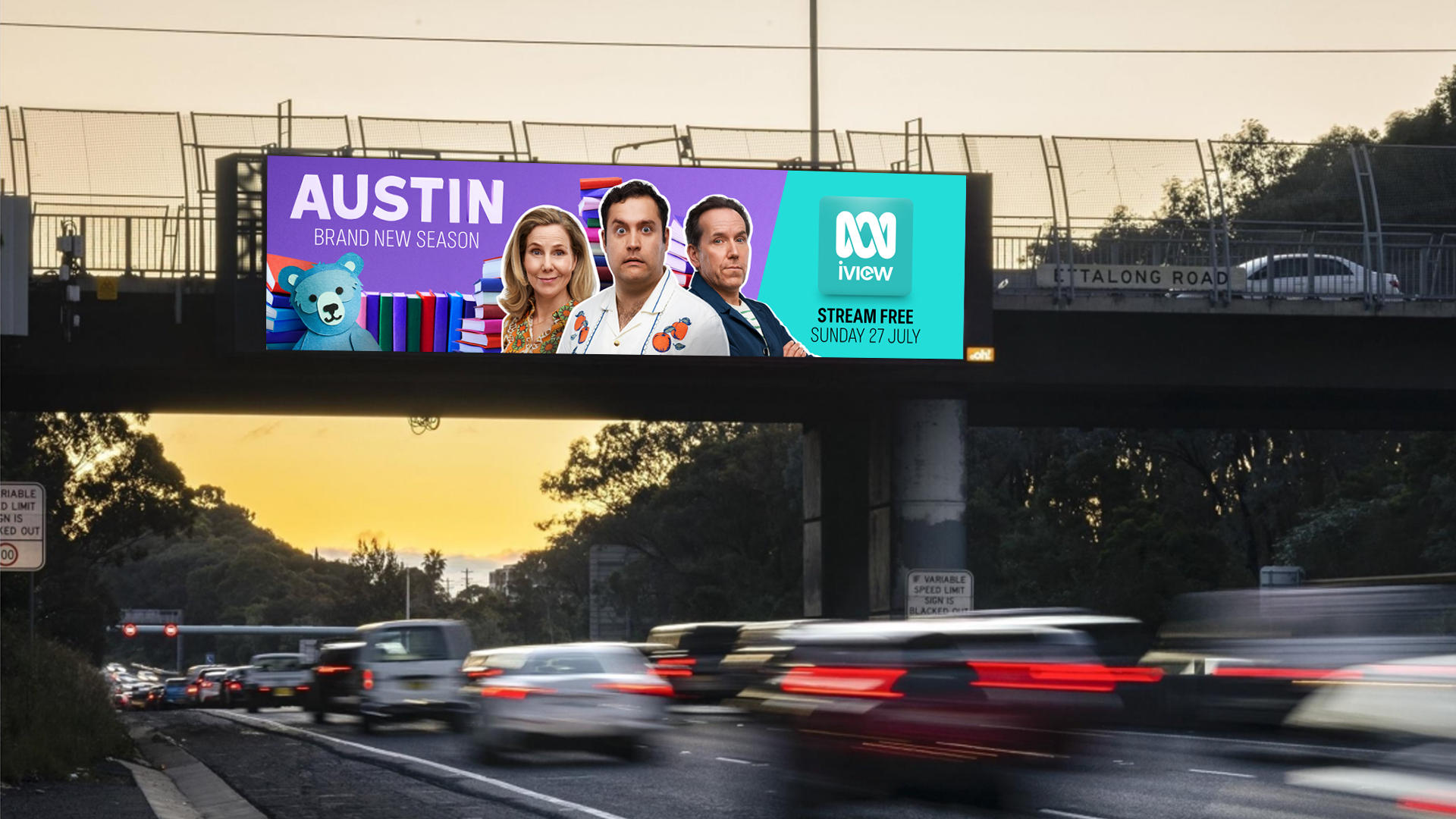
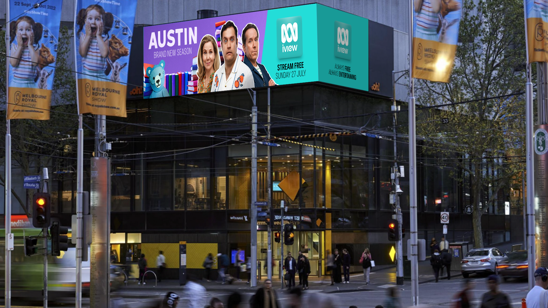
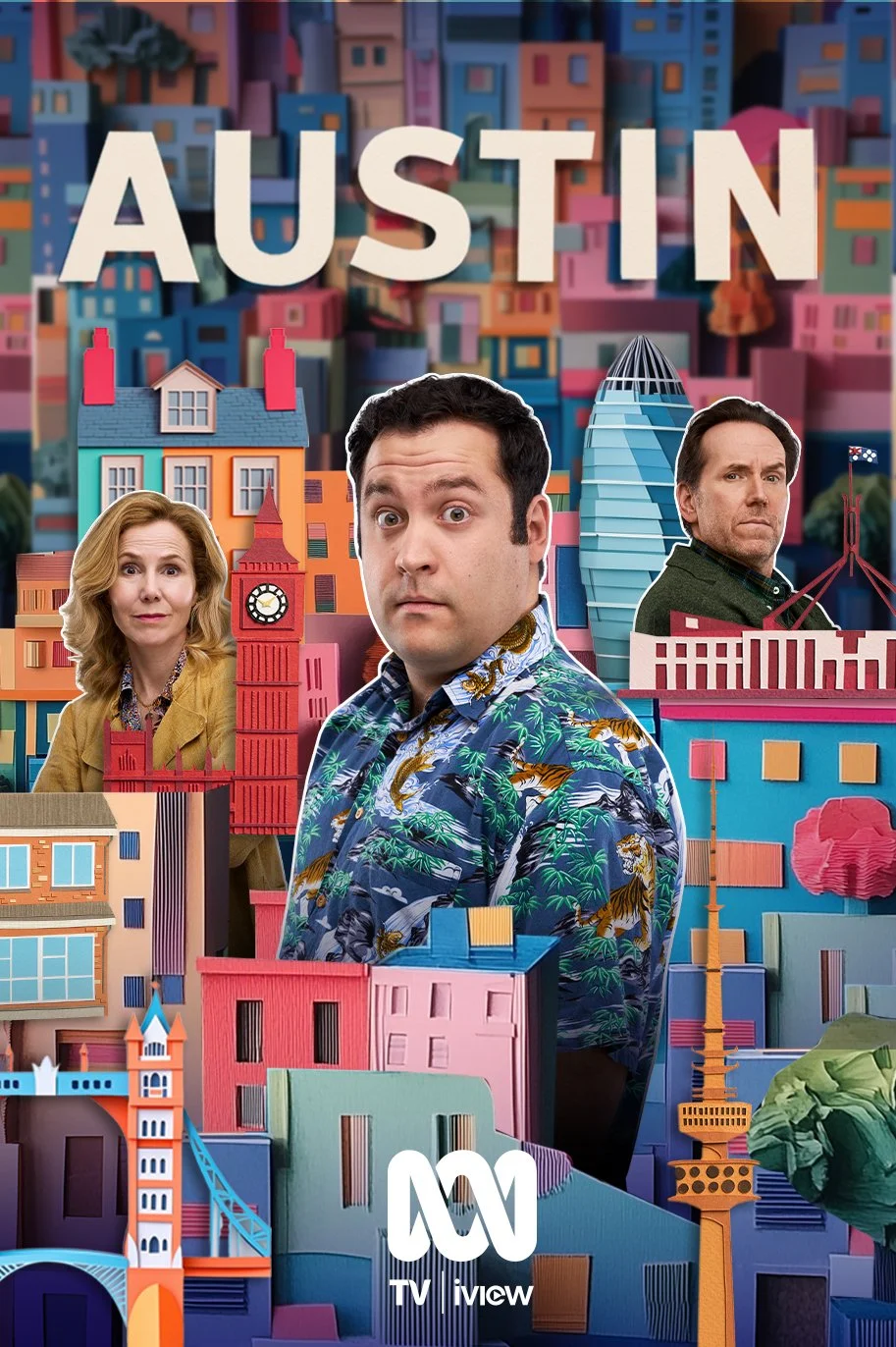
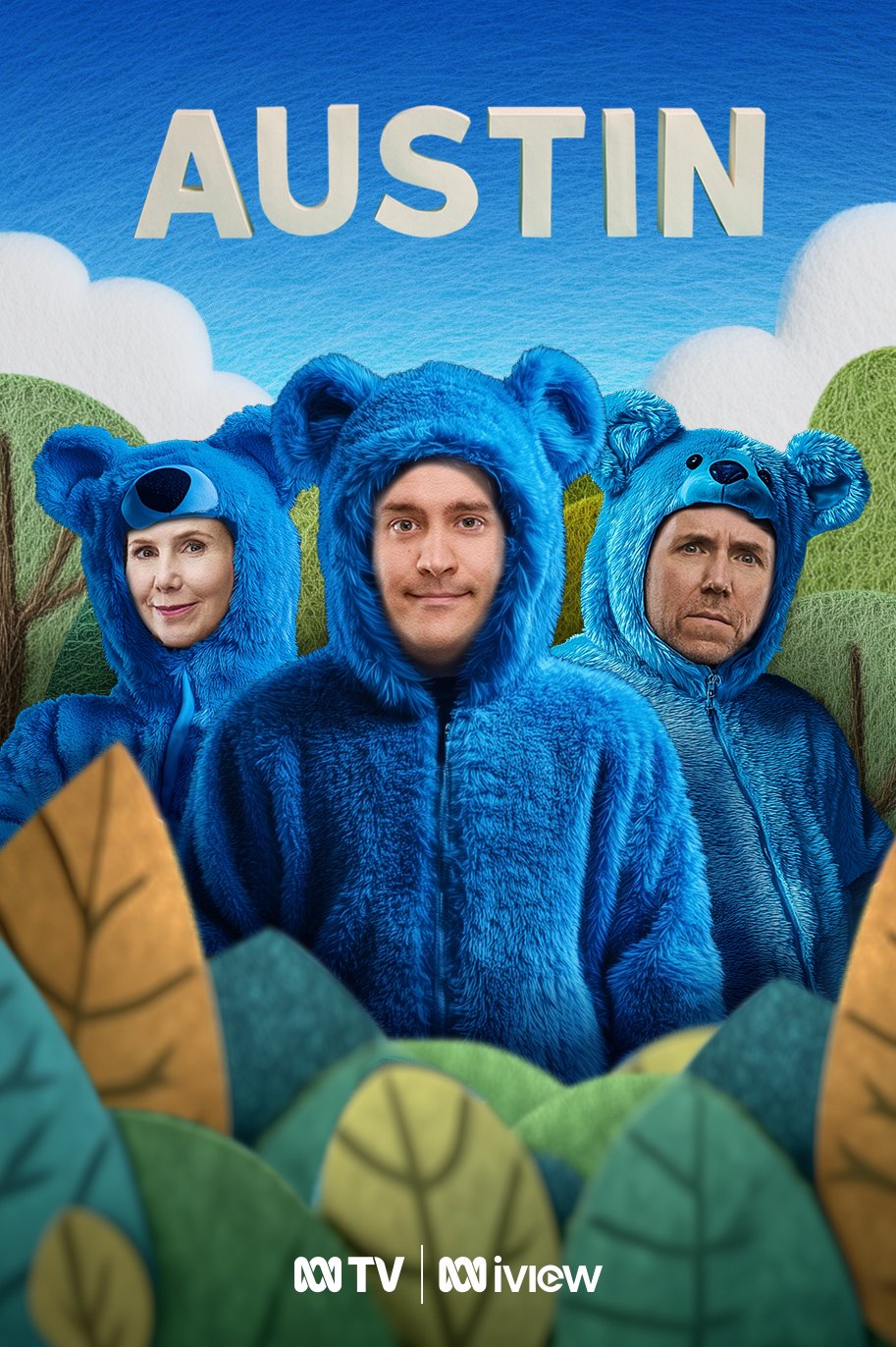
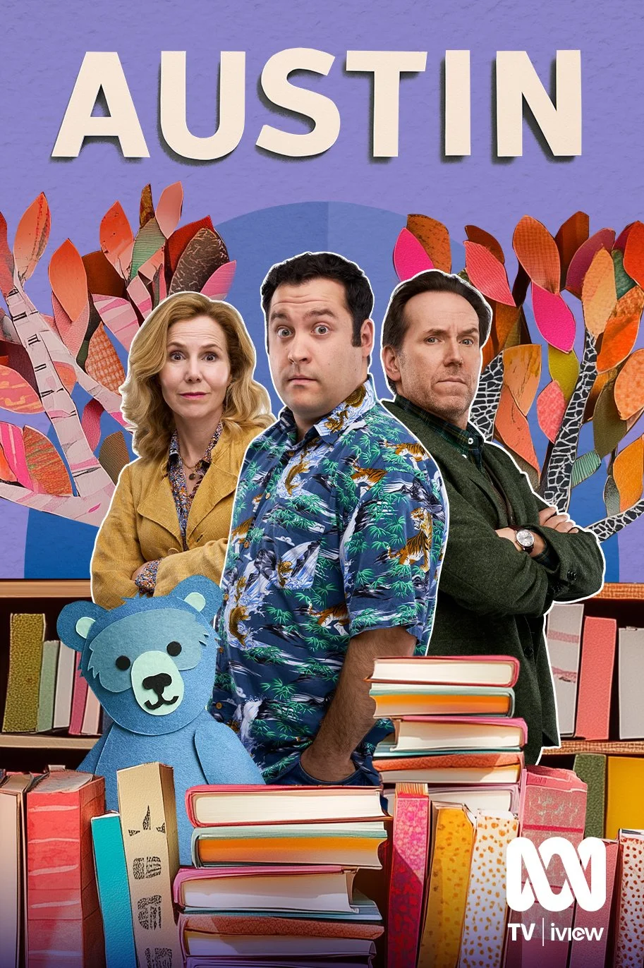
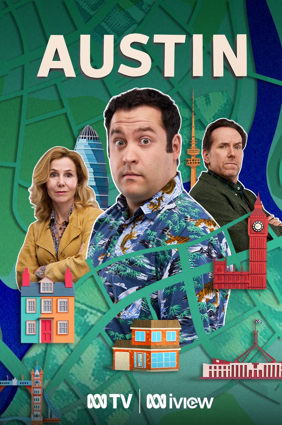
The pop-up book concept was inspired by the three main characters’ involvement in writing and publishing. The chaotic stacks of books reflect not only their shared careers but also how the content of their work is reshaping them - from Austin losing his sense of self amid newfound fame, to Ingrid and Julian being divided over creative differences.
Concept development and key art mock ups
The program key art is developed considering the tone, genre and intended audience of the program.
Key art must quickly communicate genre, tone, and target audience.
I develop a visual language from the program’s core symbols and motifs, and focus on expressing the overall tone - rather than depicting a specific scene that may not translate clearly out of context.


Production
After liaising with internal and external stakeholders, a territory or direction is chosen for the key art and campaign art.
Production process includes writing detailed briefs for collaborators including photographers and retouchers.
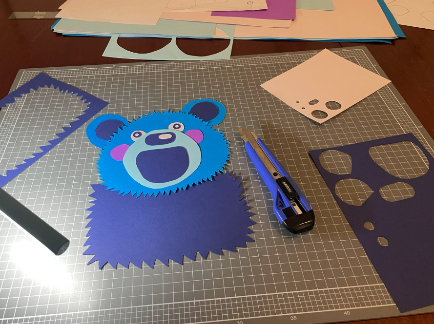
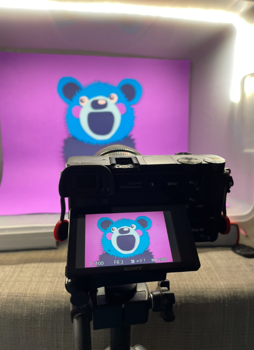
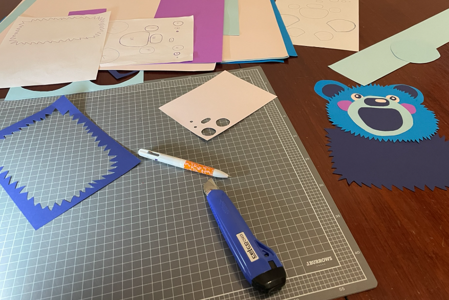
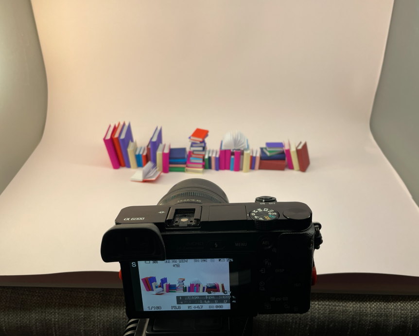
For this direction, I individually handcrafted and photographed each book and paper element in both key art executions.
The handmade books and backplate perfectly reflect the playful tone of the program and the way each character’s personal narrative spills into the world around them - messy, charming, and full of drama.

Final
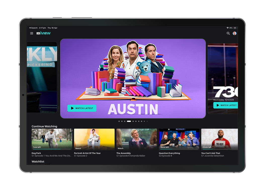
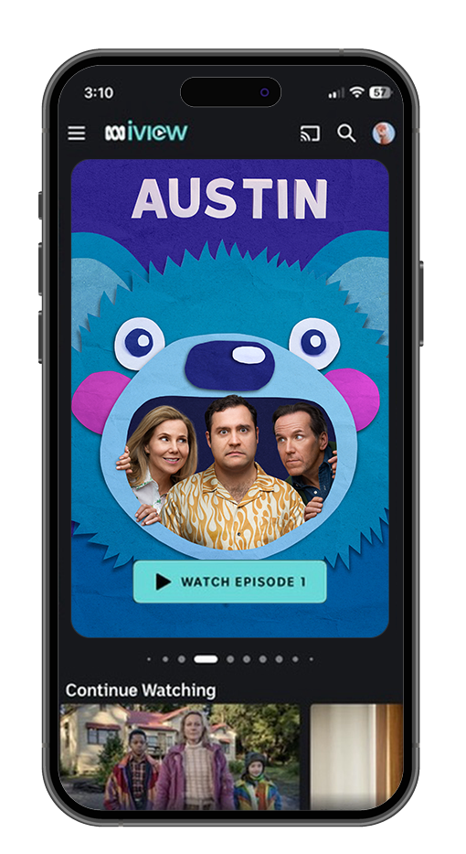
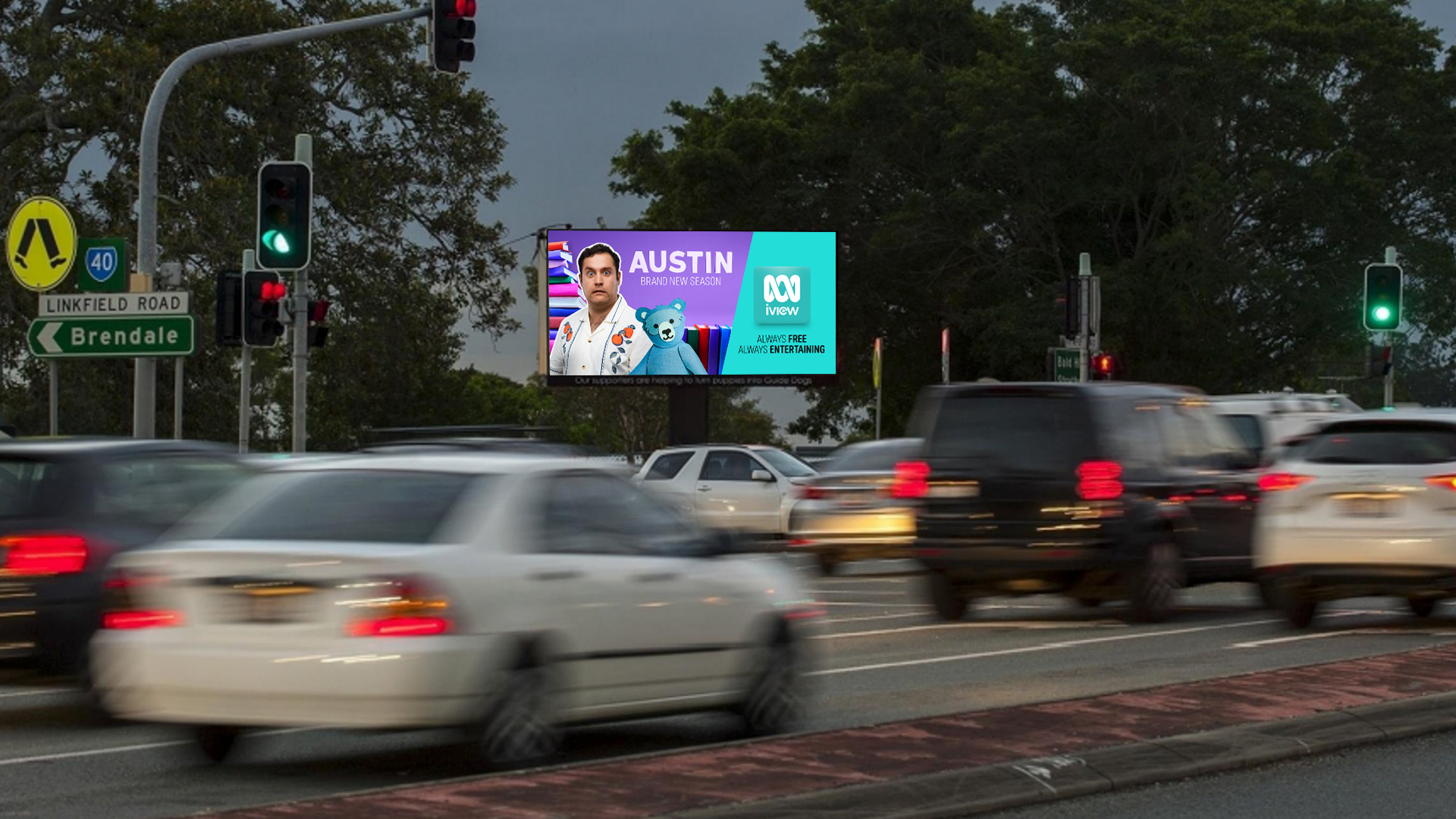
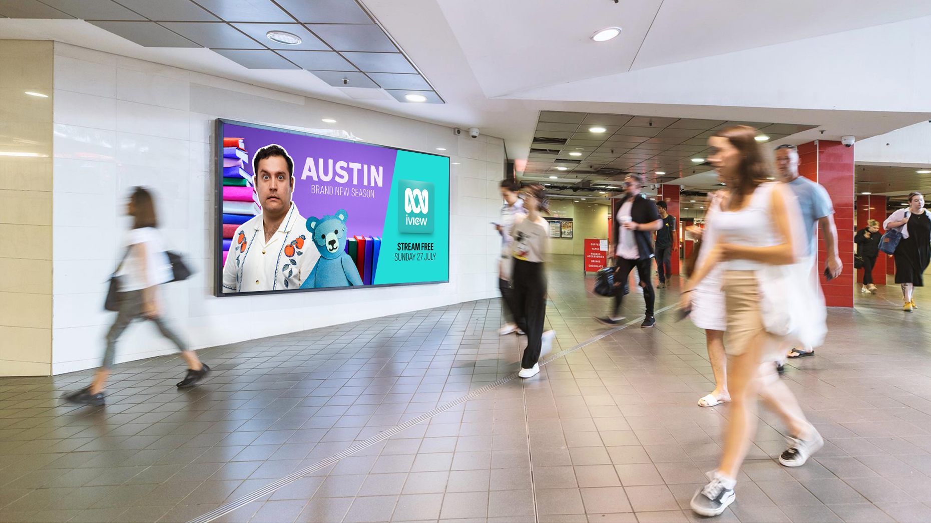
Key art was designed to adapt seamlessly across multiple formats and crops. It was rolled out across owned placements, promos and an outdoor campaign.