Aura
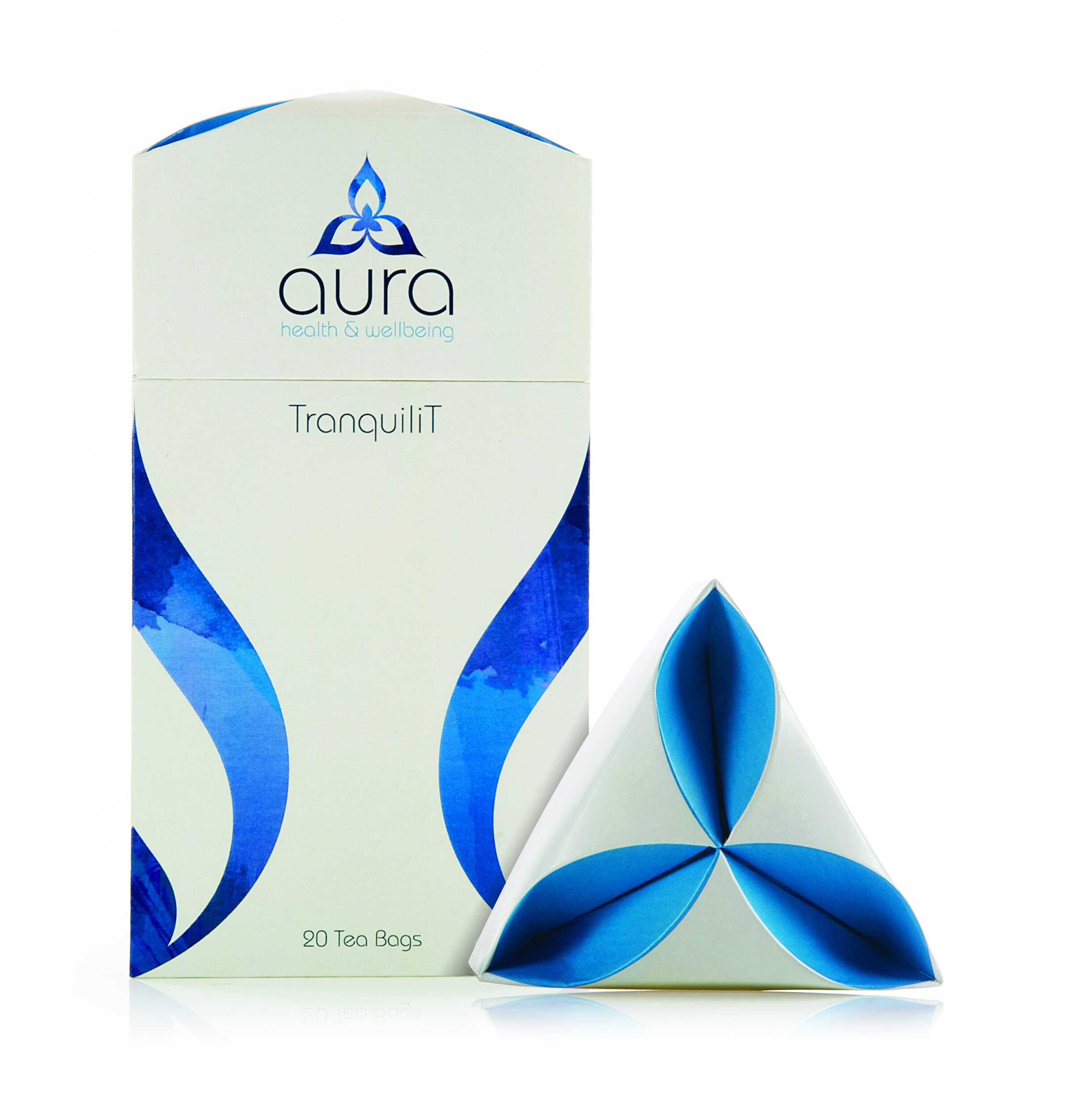
The aim of the Aura branding project was to maintain the traditional Chinese roots of the products whilst displaying a modern feel. I worked closely with the structural designers to come up with a motif that could be incorporated into the structure of the packs as well as the logo. The motif was designed to represent the shape of a tea leaf and was incorporated into the lids of the tea packaging. The branding was further designed to be versatile and flexible, able to take on any of the colours used in the Aura palette.
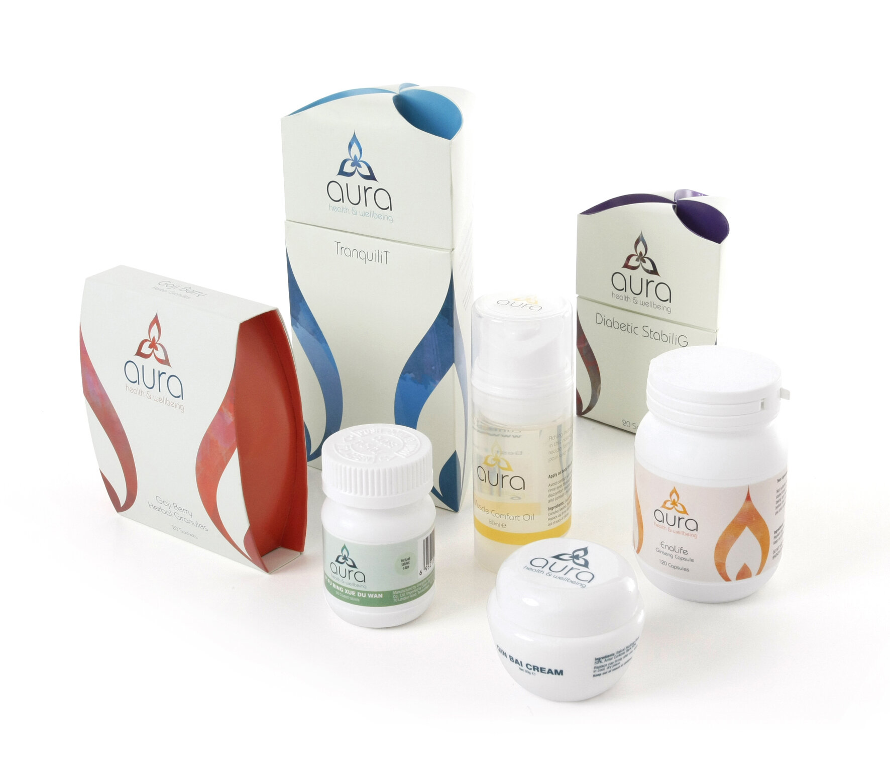
The new brand identity was used on cardboard and plastic packaging, labels, POS, signage and advertising for Aura’s organic and traditional Chinese health food, supplements, beauty and healing remedies.
The Aura packaging range received a Bronze Pentaward at the 5th edition of the annual Pentaward Worldwide Packaging Design Competition.